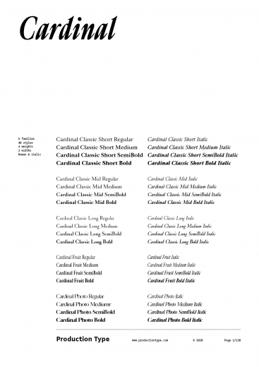
Designed for large, bold headlines, Cardinal Photo is a member of the Cardinal Collection. It is derived from the Cardinal Classic Mid series, only with more dramatic contrast, and tight, oh-so-tight spacing.
The idea behind Cardinal Photo sprung from photojournalism magazines and their typography, where headlines splash all over the page, with shallow linespacing. High contrast images and high contrast type were MFEO (made for each other.) Cardinal Photo is a natural matchmaker, referencing phototypesetting just like its sibling, Cardinal Fruit, references 80s typography. “Photo”—as in photojournalism and phototypesetting—are both concepts that translate well to digital design, where long headlines are consumed in big bites.
Why wouldn’t someone just tighten the spacing manually? Well, Cardinal has this TNT (tight but not touching) idea built-in, where the shapes closing in are meticulously placed, and already kerned for you, giving you all the credit for that tight-tight-tight design — achieving compactness without crude compression, that typographical equivalent of a car crash. Cardinal is tight so that you can stay creatively loose. Headlines, slogans, eye-catching clickbait: you name it. Cardinal is here for big things.
Cardinal Photo


Character set
Cardinal Photo in use
Download free trial
Cancel