Design:
Loïc Sander.
Team:
Sandra Carrera,
Roxane Gataud,
Yoann Minet.
These days, Didot is a typeface known for its bold stems and delicate hairlines, for its prominent ball terminals and decorative italic. These are the showy traits that made the typeface synonymous with glossy fashion magazines and luxury brands. Yet Didot’s family and history are much more complex and varied than our narrow contemporary view. What we’re missing begins with the small stuff — the metal fonts that were cut for sizes as small as 6 pt.
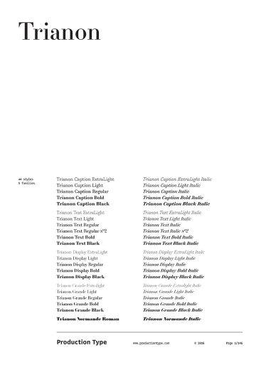
It is that small stuff that is also at the root of Loïc Sander’s exploration for Trianon. He plunged into sources from Firmin Didot’s later work as well as other type from the late 19th and early 20th centuries based on the Rational or pointed pen form model. There he discovered the qualities that are even more essential to Didot than its high contrast: its verticality, its rhythmic spacing, its ability to set readable text — one that encourages and rewards a relaxed pace. A memorable read is not necessarily the fastest, most invisible one. Trianon proves that a Didone can be much more versatile than it is usually assumed to be. Returning to the pre-digital wisdom of size-specific cuts, the family offers four optical sizes: Caption and Text built broad and sturdy for long passages of small type, and Display and Grande which imbue all of the sparkling contrast and sharp, sculpted bracketing of a familiar Didot.
Each subfamily has five weights with matching italics. The Text size comes with one extra weight for those who want paragraphs with a slightly lighter color. And ExtraLight styles bring an entirely fresh effect to Didot with their nearly monolinear weight capped by slab serifs and subtle teardrops. These inventions emphasize the fact that Trianon is not only a restoration of Didot (especially in the large sizes) but very much its own thing.
For Trianon, Sander focused on editorial publishing, where type is primarily a tool for serving content, and where he feels the call to build his own tools. The fonts are replete with useful function for editorial design, including oldstyle figures (based on the classic Didot) and lining figures (cued by vernacular street signs in France), ornaments which fit each font’s contrast and weight, and a large range of weights for building harmony and contrast into a publication’s complex hierarchy.
Awards & distinctions
Brno Biennale Official Selection 2018
Communication Arts Type Design award 2016
ATypI Typo365 best of 2015
Typefacts Best of 2015
Club des Directeurs Artistiques Prix 2015
Typographica’s favorite 2015