Synthetic organisms look human, yet are made of artificial materials. Cardinal is the equivalent of the androïd characters called “synthetics”, which were developed in the movie series Alien. Synthetics entertain a close relationship with the living world and have a troubling resemblance with the models they imitate — humans. Androïds do not emit heat, smell or pheromones, and their synthetic origin is thus hard to detect. Cardinal is an exploration of that idea in type design. It navigates between the organicity of classic text typefaces and the plasticity of contemporary digital type. It has some traits of designs by Garamont and Granjon but bears its own dryness and rigidity. Reminiscent of an era of “old digital typefaces”, Cardinal evokes the early computing days. Synthetics do not die, they are just sometimes deactivated.
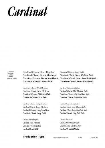
The Cardinal system is developed in three distinct directions. First, the core styles are Cardinal Classic Short, Mid, and Long, which have three x-heights that can be adjusted depending on body copy point size and line length. We recommend using Cardinal Classic Long for titles and subheads or brief paragraphs of text. Cardinal Classic Mid fits standard body text sizes, and Cardinal Classic Short works well at small sizes. Second, Cardinal Fruit is a very specific flavor of condensed, recalling early computer advertisements. Its Italics are particularly sharp and will convey a sense of liveliness and accuracy.
Designed for large, bold headlines, Cardinal Photo is a member of the Cardinal Collection. It is derived from the Cardinal Classic Mid series, only with more dramatic contrast, and tight, oh-so-tight spacing.
The idea behind Cardinal Photo sprung from photojournalism magazines and their typography, where headlines splash all over the page, with shallow linespacing. High contrast images and high contrast type were MFEO (made for each other.) Cardinal Photo is a natural matchmaker, referencing phototypesetting just like its sibling, Cardinal Fruit, references 80s typography. “Photo”—as in photojournalism and phototypesetting—are both concepts that translate well to digital design, where long headlines are consumed in big bites.
Why wouldn’t someone just tighten the spacing manually? Well, Cardinal has this TNT (tight but not touching) idea built-in, where the shapes closing in are meticulously placed, and already kerned for you, giving you all the credit for that tight-tight-tight design—achieving compactness without crude compression, that typographical equivalent of a car crash. Cardinal is tight so that you can stay creatively loose. Headlines, slogans, eye-catching clickbait: you name it. Cardinal is here for big things.