Design:
Jean-Baptiste Levée.
Team:
Yohanna My Nguyen,
Loïc Sander,
Yoann Minet,
Ben Kiel.
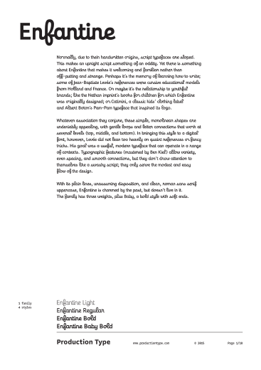
Normally, due to their handwritten origins, script typefaces are sloped. This makes an upright script something of an oddity. Yet there is something about Enfantine that makes it welcoming and familiar rather than off-putting and strange. Perhaps it’s the memory of learning how to write; some of Jean-Baptiste Levée’s references were cursive educational models from Holland and France. Or maybe it’s the relationship to youthful brands; like the Nathan imprint’s books for children for which Enfantine was originally designed; or Catimini, a classic kids’ clothing label and Albert Boton’s Pam-Pam typeface that inspired its logo.
Whatever association they conjure, these simple, monolinear shapes are undeniably appealing, with gentle loops and letter connections that work at several levels (top, middle, and bottom). In bringing this style to a digital font, however, Levée did not lean too heavily on quaint references or fancy tricks. His goal was a useful, modern typeface that can operate in a range of contexts. Typographic features (mastered by Ben Kiel) allow variety, even spacing, and smooth connections, but they don’t draw attention to themselves like a swashy script; they only serve the modest and easy flow of the design.
With its plain lines, unassuming disposition, and clean, roman sans serif uppercase, Enfantine is charmed by the past, but doesn’t live in it. The family has three weights, plus Baby, a bold style with soft ends.
Note: the live font samples displayed on this website are different from the retail fonts. They do not make use of OpenType features, alternate glyphs or extended character set.
Awards & distinctions
Typefacts Best of 2015