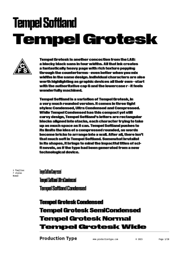
Tempel Grotesk, another concoction from the LAB, is a blocky black sans in four widths. All that ink creates a fantastically heavy page with rich texture popping through the counterforms—even better when you mix widths in the same design. Individual characters are also worth highlighting as graphic devices all their own—start with the authoritative cap G and the lowercase r—it feels wonderfully machined.
Tempel Softland is a variation of Tempel Grotesk, in a very much rounded version. It comes in three tight styles: Condensed, Ultra Condensed and Compressed. While Tempel Condensed has this compact yet still curvy design, Tempel Softland’s letters are rectangular blocks aligned into stacks, each character trying to take up as much space as it can. Tempel Softland pushes to its limits the idea of a compressed rounded, as words become bricks to arrange into a wall. After all, there isn’t that much soft in Tempel Softland. Somewhat brutalist in its shapes, it brings to mind the impactful titles of sci-fi novels, as if the type had been generated from a new technological device.