Design:
Superscript².
Team:
Quentin Schmerber,
Jean-Baptiste Levée.
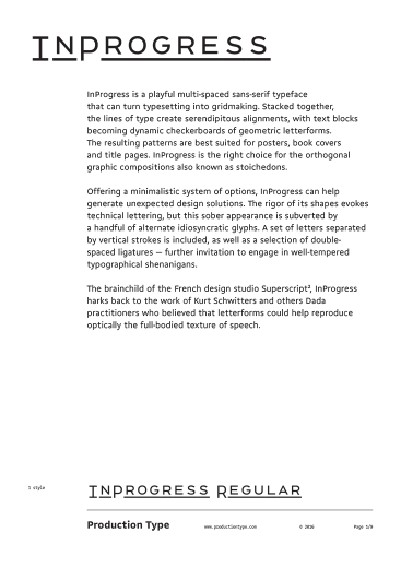
InProgress is a playful multi-spaced sans-serif typeface that can turn typesetting into gridmaking. Stacked together, the lines of type create serendipitous alignments, with text blocks becoming dynamic checkerboards of geometric letterforms. The resulting patterns are best suited for posters, book covers and title pages. InProgress is the right choice for the orthogonal graphic compositions also known as stoichedons.
Offering a minimalistic system of options, InProgress can help generate unexpected design solutions. The rigor of its shapes evokes technical lettering, but this sober appearance is subverted by a handful of alternate idiosyncratic glyphs. A set of letters separated by vertical strokes is included, as well as a selection of double-spaced ligatures — further invitation to engage in well-tempered typographical shenanigans.
The brainchild of the French design studio Superscript², InProgress harks back to the work of Kurt Schwitters and others Dada practitioners who believed that letterforms could help reproduce optically the full-bodied texture of speech.
